
 This
Brief describes the various plot types that can be created by Mira for
visualizing 1-D data. Mira's plotting architecture was designed to efficiently and effectively work with
data sets consisting of many points, many images, and many series. Mira can
create representations like step-line plots and x/y error bars. The Mira
Plot Window was designed for interactively displaying and measuring 1-D data
in real time. A non real-time "Chart" package for creating
presentation-quality plots is also included.
This
Brief describes the various plot types that can be created by Mira for
visualizing 1-D data. Mira's plotting architecture was designed to efficiently and effectively work with
data sets consisting of many points, many images, and many series. Mira can
create representations like step-line plots and x/y error bars. The Mira
Plot Window was designed for interactively displaying and measuring 1-D data
in real time. A non real-time "Chart" package for creating
presentation-quality plots is also included.
Although most plots are made from data in an Image window, plots can also be generated from tabular measurements and by using the extensive and versatile collection of plotting functions in the scripting module. Not discussed here are topics like scripted plots, working with plot data, plot commands, toolbars, plot attributes, etc.
Plot Types
The table below describes plotting capabilities of various Mira platforms. Not all features are in all platforms, and such cases are noted. Pictures...
Column Profile |
Plots the intensity of a single column or all columns in a region of interest, for 1 image or an image stack. The single column intensity may also be the mean, median, or sum of all columns in the region of interest. |
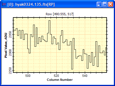
Row Profile |
Plots the intensity of a single row or all rows in a region of interest, for 1 image or an image stack. The single row intensity may also be the mean, median, or sum of all rows in the region of interest. |
Line Profile |
Plots the intensity along a drawn line between two points. Optionally, the starting or ending point may be auto-centroided to the moment-weighted local maximum or minimum sub-pixel position. Additional intensity series may be added to the plot using lines exactly parallel to or displaced from the first line. |
Radial Profile Plot |
Plots the radial intensity profile in all directions from a sub-pixel positioned center point. Optionally, the center point may be auto-centroided to the moment-weighted local maximum or minimum sub-pixel position. Optionally, a Gaussian + Constant model may be fit to the sample data and the results reported for estimation of FWHM, Peak intensity, and background luminance. |
Histogram Plot |
Shows the frequency distribution of image values inside a region of interest. The plot may be made for one image or an entire image stack may be plotted on the same set of axes. |
Bit Histogram Plot |
Plots the frequency of bit values inside a region of interest. The plot may be drawn for one image or an image stack. (Mira Pro and Mira Pro x64) |
Scatter Plot |
Plots discrete points from tables containing measurement results. The columns to plot are selected from the table. (Mira Pro x64) |
Pixel Series Plot |
Plots multiple plot series showing the pixel value at a given location for the members of an image stack. (Mira Pro and Mira Pro x64). |
Custom Plots |
Plots can also be generated by the Pro Script module. In addition to the plot types above, scripted plots may contain any number of points in any number of series with any combination of lines, points, error bars, colors, attributes, etc. |
Data Fitting |
Mira Pro x64 provides an outstanding tool for analyzing 1-dimensional data using polynomial regression. Features include iterative sigma clipping, forced coefficient values, selectable data series, auto-rejection, manual deletion and weighting, and more. More |
Examples
 |
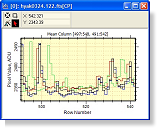
A Simple PlotThis shows a simple plot along a single column of an image. The Plot Toolbar (at the top of the window in other pictures, below), is disabled in this view. |
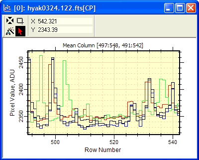 |
Overplot of Column Intensity Plots from 5 ImagesThe Image Window displayed a stack of 5 images. A single button click plotted the same column in each image. The colors assigned to the 5 plot series can be specified. At the top of the window is shown the Plot Toolbar provided with Mira Pro. |
 |
Animating the 5 Column Plots (from above)Using the same data as above, the Plot Windows was switched to Animate mode. This shows 1 plot series at a time which can be stepped, selected, or animated in various ways. At the top of the window is shown the Plot Toolbar provided with Mira Pro x64. |
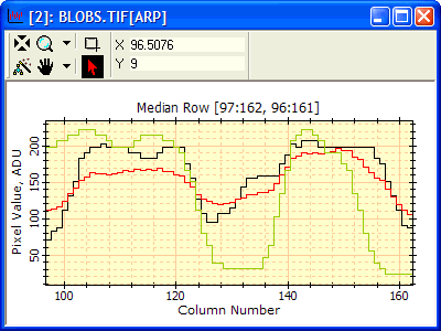 |
Comparing Plots on the Same Axes (Mira Pro x64)Separate plots were created for a single row slice, a median row slice and a mean row slice (each in a different window). The Single Row and Median Row plots were appended to the Mean Row plot using the plot copy+paste commands in Mira Pro and Mira Pro x64. |
 |
Comparing Histograms of several images (Mira Pro x64)This example plots the histogram of the same region of interest in 5 images. The images were opened as an image stack, then the histogram plot button clicked once. All plots were originally drawn in black. The plot for image 2 was changed to red as a reference for comparison with the other histograms. [Changing attributes of individual plot series is a feature of Mira Pro x64.] |
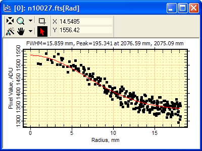 |
Radial Profile Plot with FitThis example shows a standard Mira feature of all platforms: the radial profile plot. This type of plot is important for characterizing the point spread function of an image. A "Gaussian + Constant" or "Moffat + Constant" model is fit to the radial data and used to estimate the FWHM, Background, and Peak value of the profile. Even with very low signal to noise ratio data, as shown here, Mira's fit is robust and the estimated parameters are accurate. In addition, the visual drawing of the fit through the data provides an unambiguous check on the validity of the estimated parameters. |
 |
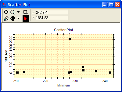
Scatter Plot with Polynomial Fit (Mira Pro x64 - in Development)This example shows the result of making, plotting, and performing regression analysis on the results of image measurements. Staring with a table of measurements, 6 button clicks and about 10 seconds selected and plotted the target data columns and produced the regression results.
|
 |
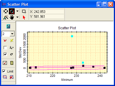
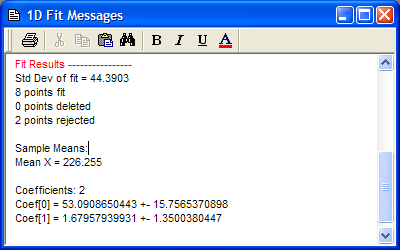
Scatter Plot with Polynomial Fit (Mira Pro x64 - in Development)This example shows a scatter plot with a 3-term polynomial fit. The data were generated by a script that computed the regional minimum value from several images. The script created and populated the Plot Window. After the script terminated, in Mira Pro x64, the 1d-Fit toolbar was opened and the fit computed interactively on the data. This fit uses iterative sigma clipping. The upper and lower purple curves show 3 sigma deviations from the fit, which shows no points rejected. The black and red points show two different plot series resulting from the two groups of images being compared. |
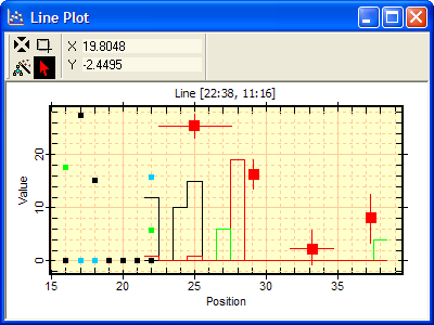 |
Custom Plot Created by a ScriptThis illustrates the versatility of plots generated by Mira Pro x64 Script module. This plot mixes points symbols, step-lines, x and x-y error bars, etc. See the online Script User's Guide. |