Examples of Row Plots
The figures below show variations on Row Profile plots that can be easily made using Mira 7. The same methods can be used to create and work with column profile plots. As with column profile plots and histogram plots, row profile plots use the image cursor to define the region of points to plot.
The row plots shown below are created using
commands in the Plot Menu and Context Menu of Image Windows, and from buttons on the Image Plot Toolbar when an image window has the
focus. These plots show a single image but an entire image set can
be plotted by changing the state of the ![]() button on the Image Toolbar.
button on the Image Toolbar.
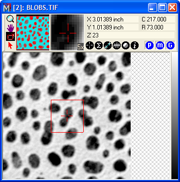
These plots use the image shown below. This image is with other sample images in the folder "My Pictures\Mirametrics\Mira Pro 7 UE\Sample Data". The image cursor outlines the region of interest containing points to plot.
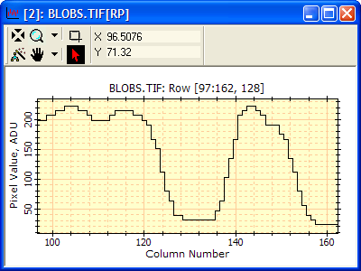
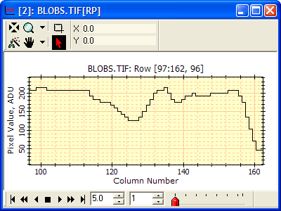
The next figure shows a simple row plot for a single row at the middle of the image cursor. There are various ways to create this plot:
Click the ![]() button
on the Image Plot toolbar.
button
on the Image Plot toolbar.
Click the down-arrow on the ![]() button of the Image Plot toolbar,
then select Single Row from the menu.
button of the Image Plot toolbar,
then select Single Row from the menu.
Click Plot > Horizontal > Single Row on the main menu.
Right-click on the image to open the Image Context Menu, then click Plot > Row on the context menu.
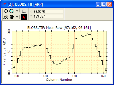
The next plot shows the mean row obtained by
averaging all the rows inside the image cursor into a single plot
series as shown below. Various averaging modes are available,
including mean, median, and sum; these are selected from the
![]() drop-down menu or from the
other menus mentioned previously. To create this plot, click the
down-arrow and select Mean Row. If Mean Row is not shown in the
menu, use the Averaging Mode > Mean command to change the mode
and then select Mean Row.
drop-down menu or from the
other menus mentioned previously. To create this plot, click the
down-arrow and select Mean Row. If Mean Row is not shown in the
menu, use the Averaging Mode > Mean command to change the mode
and then select Mean Row.
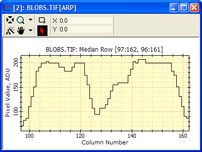
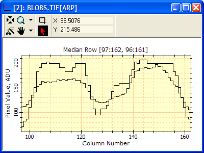
The next plot shows the median row obtained by
combining all the rows inside the image cursor into a single plot
series as shown below. For each column coordinate, x, the values at
the same x in parallel rows are combined by the median to produce
the plotted value. To make a median plot, click the down-arrow on
the ![]() button and select Median Row.
If Median Row is not shown in the menu, use the Averaging Mode >
Median command to change the mode and then select Median Row.
button and select Median Row.
If Median Row is not shown in the menu, use the Averaging Mode >
Median command to change the mode and then select Median Row.
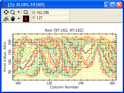
The next figure shows all rows plotted together in
Overplot mode. This plot was created using the Range of Rows
command in the drop down menu of the ![]() button. The colors of the various
plot series are set on the Plot Preferences page. All plots could have been
assigned the same color, such as black, or a different line
width.
button. The colors of the various
plot series are set on the Plot Preferences page. All plots could have been
assigned the same color, such as black, or a different line
width.
The next plot shows the same range of rows with the window switched to one of the animation modes using the Plot Context Menu. These modes show one plot series at a time, allowing you to step or animate through the plot set. This effectively sweeps upward or downward through the rectangle outlined by the image cursor. To change the mode, right-click on the plot window to open the Plot Context Menu and then select the mode from the Plot Series Mode > submenu. Use the Plot Animation Toolbar on the bottom window border to step or animate the plot set.
Now let us combine the data plotted in 2 separate windows into a single Plot Window. To do this, click on the title bar of the Median Row Plot from above, then use Ctrl+C to copy its plot data. Then click the title bar of the Mean Row Plot we made above and press Ctrl+V to paste the median row plot into the window showing the mean row plot. We now have a plot set of 2 series in the window which can be viewed singly or together, as described above. The result looks like this:
To change the attributes of the individual plot
series after they are plotted, use the Plot Series
Attributes window. Here, we will change the color of the series
containing the mean row plot. To do this, use Ctrl+X (or right
click ![]() on the Plot Toolbar)
to open the Plot Series Attributes window. Change the plot series
attributes as desired and then click [OK] to close the Attributes
window.
on the Plot Toolbar)
to open the Plot Series Attributes window. Change the plot series
attributes as desired and then click [OK] to close the Attributes
window.

Now, add the Single Row plot to the same target window using the Ctrl+C/V method. This gives 3 plot series in the window. Open the Plot Attributes window and change the color of Series 3 to green as shown below.
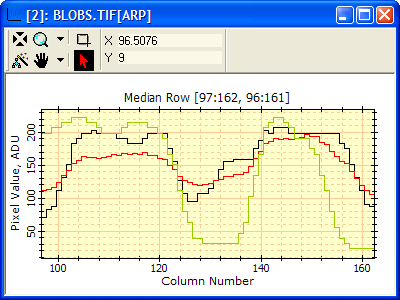
We now have a plot that directly compares a single row with its neighborhood mean and neighborhood median.