Tutorial: Making a Scatter Plot of Measurements
Mira uses the Scatter Plot command to graph the values in two columns of the table in a Report Window. The scatter plot command also has the ability to plot error bars in both the x and y directions. In the example below, statistics measurements were used to create 2 scatter plots, one from measurements of a single image and the other from a single measurement of an image set.
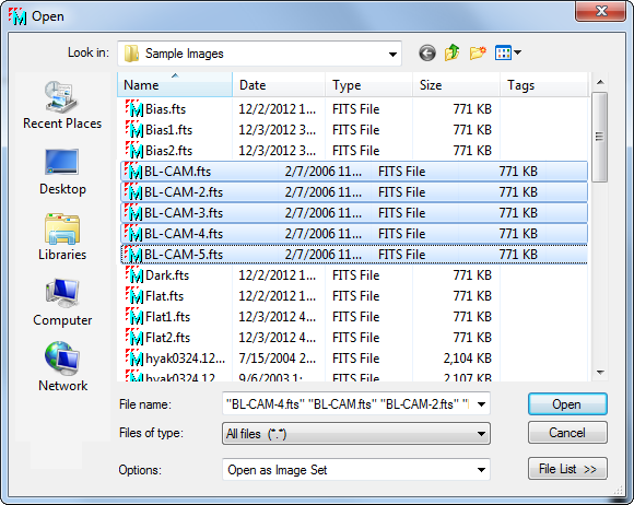
First, open an image set for the BL-CAM*.fts sample images provided with the Mira installation. Use File > Open to open the dialog below, then select all 5 images as shown:
In the Options box at the bottom of the dialog, notice that the "Open as Image Set" option is chosen so that all 5 images will be opened into a singleImage Window.
 For the first
example, you will makes measurements of a single image even though
an image set is opened. To do this, make sure the Measure image set flag is
set to "single image" mode with the
For the first
example, you will makes measurements of a single image even though
an image set is opened. To do this, make sure the Measure image set flag is
set to "single image" mode with the ![]() button as shown at left (circled in
red). In single image mode, the Measure Image Set
button on theImage
Toolbar appears gray as shown.
button as shown at left (circled in
red). In single image mode, the Measure Image Set
button on theImage
Toolbar appears gray as shown.
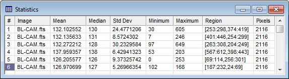
Activate Cursor Mode and move theimage cursor around to several location in the
first image, clicking the ![]() button at each
location to measure statistics. Each measurement adds a new row to
the statistics table. Before the first measurement, the table was
cleared using the View > Clear command in the pull-down
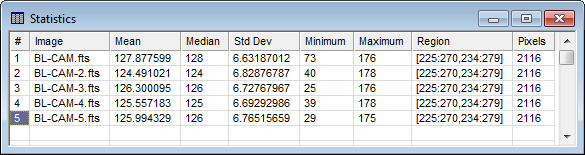
menu for the Report Window. After 6 such measurements, the Statistics report
looks like this:
button at each
location to measure statistics. Each measurement adds a new row to
the statistics table. Before the first measurement, the table was
cleared using the View > Clear command in the pull-down
menu for the Report Window. After 6 such measurements, the Statistics report
looks like this:
The table was in Single Selection Mode (set in the Report Context menu) so that all rows would be plotted. Next, the Scatter Plot dialog was opened by right clicking on the table:
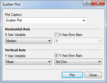
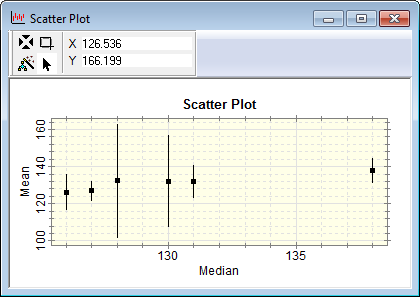
In this dialog, the # column (sequential measurement number) was selected for the horizontal axis variable and Mean column (mean value) was selected for the vertical axis variable. After checking the Y Axis Error Bars option, the Std Dev column (standard deviation) was selected for the error bars. This produced the following plot showing the Mean value and its variation for each image location:
Another example of a measurement that is quick to get involves opening a series of images as an image set, then making a single statistics measurement at one location of the Image Cursor. The statistics report looks like the following:
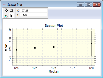
This produced the following scatter plot. As you can see from the report, the median value is identical for measurements 3 and 5. This produced two nearly-overlapping points in the plot.
Contents, Tutorials, Scatter Plot, Report Windows, Report Context Menu, Selecting Cells in a Report Table